Task
Compute the valuation of a set of random portfolios at one or more times. These can then be plotted.
Preparation
This presumes that you have mastered either “Very simple long-only” or “Very simple long-short”. That is, that you’ve managed to create a random portfolio object.
- random portfolio object
- Portfolio Probe
You need a random portfolio object with which to create valuations.
You also need to have the Portfolio Probe package loaded into your R session:
require(PortfolioProbe)
If you don’t have Portfolio Probe, see “Demo or Buy”.
Doing the example
rploVerysimpobject from the “Very simple long-only” examplepprobeDatapackage
You need to have the package loaded into your R session:
require(pprobeData)
Doing it
We do these tasks:
- distribution of valuations at one point in time
- valuation paths through time
Distribution of valuations at one point in time
We create the valuations by using prices at the time point of interest:
valEnd07 <- valuation(rploVerysimp, xassetPrices[502,],
    collapse=TRUE)
This uses the prices at the close of the last trading day of 2007, so one year after the portfolios were formed with a valuation of (slightly less than) $1,000,000.
The valuations are:
> valEnd07
[1] 1366810.7  843313.3  943556.4 2100184.8
attr(,"timestamp")
[1] "Tue Sep 04 11:45:03 2012"
attr(,"call")
valuation.randportBurSt(x = rploVerysimp, prices = xassetPrices[502,
    ], collapse = TRUE)
In a real application we would probably want to use hundreds or thousands of portfolios. But the commands don’t know if the object contains 4 portfolios or 4 million.
We plot the density estimate (which of course is silly for 4 datapoints) of the valuations like:
plot(density(valEnd07/1e6), xlab="Valuation (millions)")
This command creates Figure 1.
Figure 1: Close to default plot of valuation density. 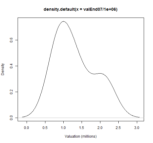
If you were doing the plot just for yourself, you probably wouldn’t even add the ‘xlab‘ part. Figure 2 cleans up the plot so it is more presentable to others.
Figure 2: Cleaned up plot of valuation density. 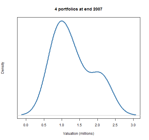
This was done with the command:
plot(density(valEnd07/1e6), xlab="Valuation (millions)",
   col="steelblue", lwd=3, yaxt="n",
   main="4 portfolios at end 2007")
This makes the main (top) title informative, widens and colors the density line, and erases the numbers on the y-axis as they tend to distract more than inform.
Valuation paths through time
Instead of focusing on valuations at one specific time, we look at the evolution of value over time.
To do this we need to use a matrix of prices for the times (and assets) of interest:
valDaily07 <- valuation(rploVerysimp,
   xassetPrices[251:502,], collapse=TRUE)
The result is a matrix with as many rows as the price matrix that we gave to valuation and as many columns as random portfolios.
We can just plot the paths without trauma:
matplot(valDaily07, type="l")
The result of that command is Figure 3.
Figure 3: Default plotting of valuation paths. 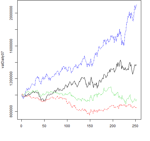
If you really do have only a few paths and you want to emphasize them, you might do something like:
matplot(valDaily07/1e6, type="l", lwd=3, lty=1,
   col="steelblue", ylab="Value (millions)",
   xlab="Trading day in 2007")
The command above produces Figure 4.
Figure 4: Plot suitable for a few paths. 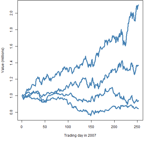
More likely you will want the random paths to be rather muted, and serve as background to something else. Perhaps something like:
 matplot(valDaily07/1e6, type="l", lwd=1, lty=1,
   col="gold", ylab="Value (millions)",
   xlab="Trading day in 2007")
abline(h=1, col="steelblue", lty=2)
This produces Figure 5.
Figure 5: Plot with random portfolios as background. 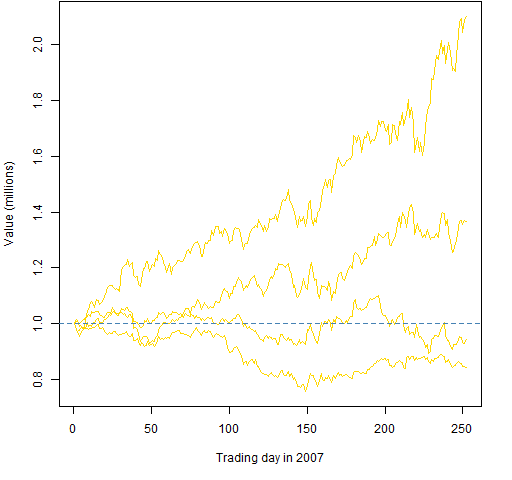
Explanation
The valuation function can do quite a lot. We’ve seen that it can take prices at either one time or multiple times and return something sensible.
The density function returns an object of class "density" and there is a plot method for that class. You can think of it as plot knowing how to plot densities.
The matplot function plots matrices. We are giving it just one matrix so it assumes that we want the x-axis to be the row number. The ‘type="l"‘ tells it that we want lines (and not points). We also used arguments to control line width, line type and color.
The abline function adds lines to an existing plot. The ‘h‘ argument draws horizontal lines. So ‘h=0:10‘ will draw horizontal lines at all the integers between 0 and 10, inclusive. The ‘v‘ argument does vertical lines. If you give it two numbers, then that will be the intercept and slope. So the command ‘abline(0, 1)‘ draws the line y=x.
Checking your work
We know that the portfolios were generated to have 1 million at the start of the year. That’s the behavior that we see in Figures 3 through 5 — so that’s good.
See also
Navigate
- Back to “Random Portfolio Generation”
- Back to the top level of “Portfolio Probe Cookbook”
