Summary
Compare historical fund returns to what would have happened by chance.
The strategy is to gauge skill by picturing what luck looks like.
Description
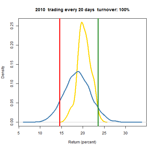
We’ll start with a picture that is a fund’s return for the year 2010, plus additional information on returns for the year.
- red: the return of the fund
- green: the return if the fund had done zero trading during the year
- blue: distribution of static random portfolios obeying the fund constraints
- gold: distribution of dynamic random portfolios that start the year with the same positions as the fund, and trade through the year like the fund traded
If we just had the red line and the blue distribution, then that would be very much like using a peer group: we compare the fund return for the period with the returns for the period of a cohort of peers. There is a long list of ways in which peer groups are inferior, though. Here’s one:
With random portfolios we know that what is represented is pure luck. Peer groups give us impure luck — we have no way of knowing how much is luck and how much is skill (that’s what we’re trying to find out). We get results from peer groups, but we don’t know what those results mean.
It may be that the red versus blue analysis is as far as we can go — that’s as much data as we have. We would conclude that the fund moderately underperformed.
But if we know the positions of the fund at the beginning of the period and the turnover of the fund, then we can learn much more. We do this with two comparisons:
- green versus blue tells us how decisions made prior to 2010 did in 2010.
- red versus gold tells us how decisions made in 2010 did in 2010.
In the picture green versus blue says that the decisions made prior to 2010 were quite good in 2010. In contrast the decisions made during the year were not at all good during the year. So the moderately bad result we inferred from red versus blue is a combination of opposing results.
We can also compare red versus green. This is probably more powerful than peer groups or benchmarks, but what is missing is significance. We’ll know if trading yielded a bigger or smaller return, but we will not know if the difference is just noise. As we can see by comparing green versus gold, it would have been very hard in this case to get a better return by trading — almost all trading would look bad via the naive test.
The comparison of red versus gold need not be just in 2010. You could compare them in 2011 as well to answer the question: How well did the decisions made in 2010 do in 2011?
Market Synopsis
There are numerous ways to get the old methods of peer groups and benchmark-relative performance.
Random portfolios are also available from PPCA: PODs and PIPODs.
The advantage of PIPODs over Portfolio Probe is that the distributions are already created for you — you just need to locate your return in the appropriate distribution.
The advantage of Portfolio Probe over PIPODs is that you can specialize the constraints and the time period to suit yourself (the StockTrib offering for performance attribution from PPCA does provide some customization). In particular, with Portfolio Probe you have the power of the shadowing method (the gold distribution) at your disposal. You also have immediacy — you can get performance in real-time.
Pertinent blog posts
The performance category.
In particular, there is:

