A review of market predictions and results for 2011, and a calibration for 2012 predictions (of 19 equity indices plus oil).
Previously
One year ago the post “Revised market prediction distributions” presented plots showing the variability of various markets assuming no market-moving forces.
The follow-up post “Some market predictions enhanced some of those plots with predictions for 2011.
I did a review of Future Babble (which I think is apropos).
Orientation
The distributions are an attempt to see the variability if there were no market-driving news for the whole year.
Another way of thinking of it is that if someone has a prediction for the year, then moving the distribution to center on the prediction gives a sense of what results should be expected if the assumptions of the prediction are exactly right.
The green lines in the plots indicate the starting point for the year. The red lines indicate the final point. The purple lines indicate predictions from various people.
North America
Figure 1: Dow Jones Industrial Average (USA) 2011 prediction distribution. 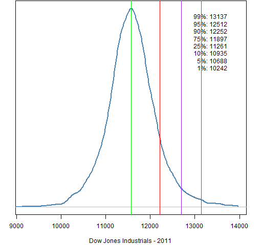
Figure 2: Dow Jones Industrial Average (USA) 2012 prediction distribution. 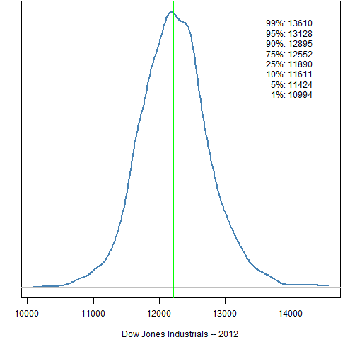
Figure 3: S&P 500 (USA) 2011 prediction distribution. 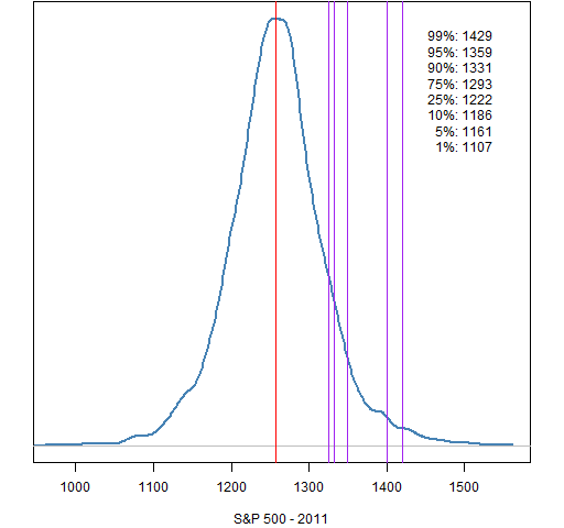
Figure 4: S&P 500 (USA) 2012 prediction distribution. 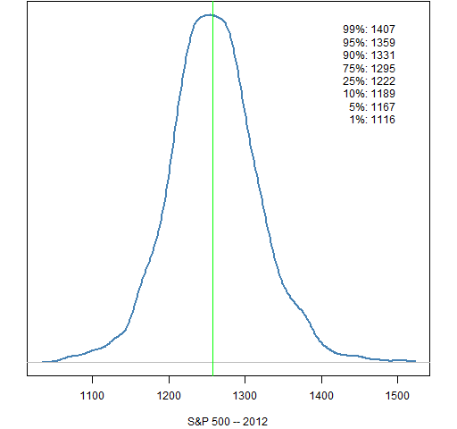
Figure 5: Nasdaq Composite (USA) 2011 prediction distribution. 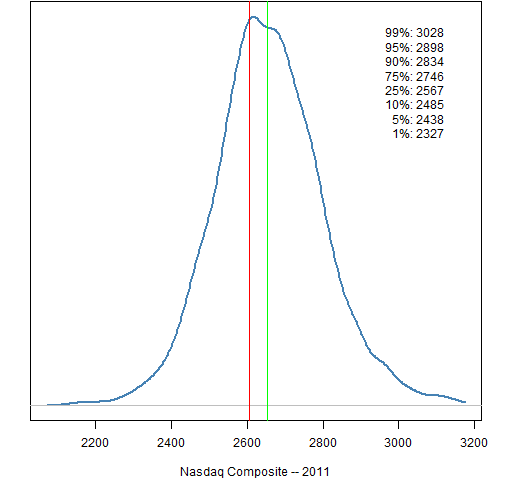
Figure 6: Nasdaq Composite (USA) 2012 prediction distribution. 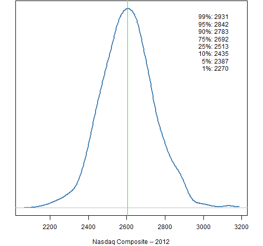
Figure 7: S&P/TSX Composite (Canada) 2011 prediction distribution. 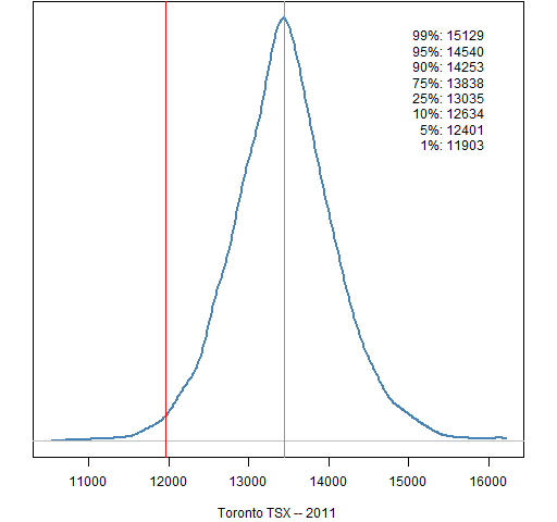
Figure 8: S&P/TSX Composite (Canada) 2012 prediction distribution. 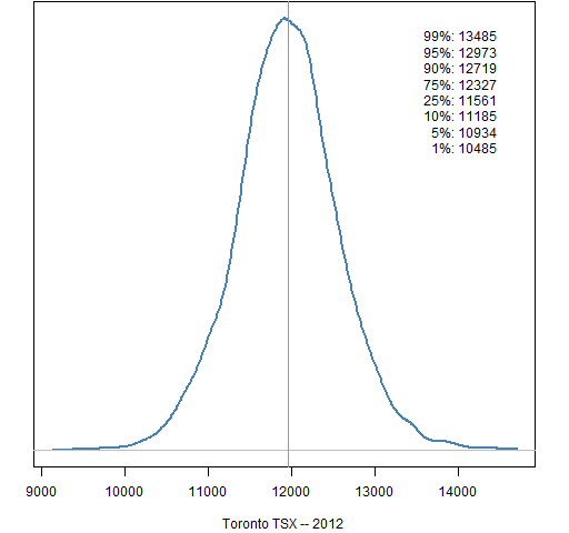
Figure 9: IPC (Mexico) 2011 prediction distribution. 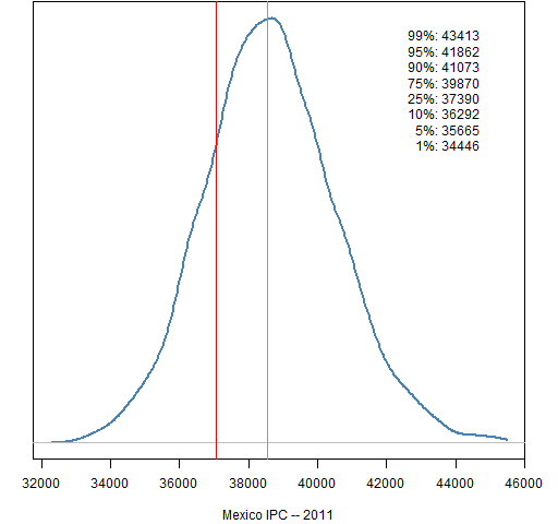
Figure 10: IPC (Mexico) 2012 prediction distribution. 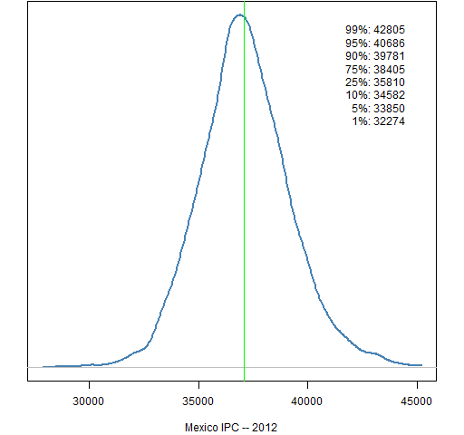
South America
Figure 11: Bovespa (Brazil) 2011 prediction distribution. 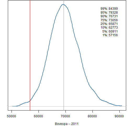
Figure 12: Bovespa (Brazil) 2012 prediction distribution. 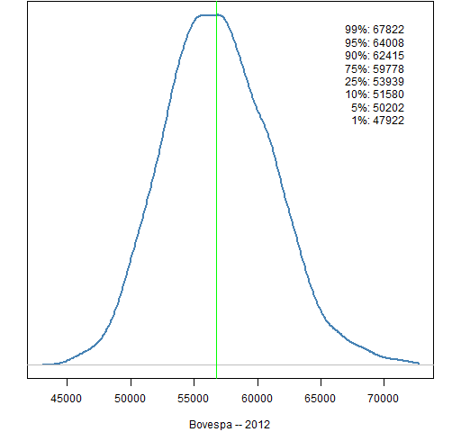
Figure 13: MERVAL (Argentina) 2011 prediction distribution. 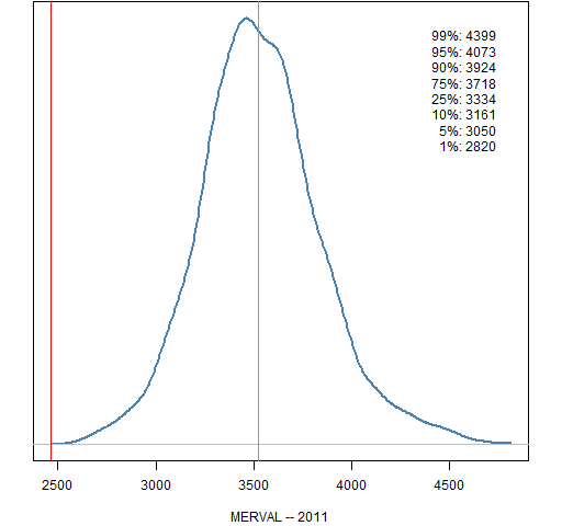
Figure 14: MERVAL (Argentina) 2012 prediction distribution. 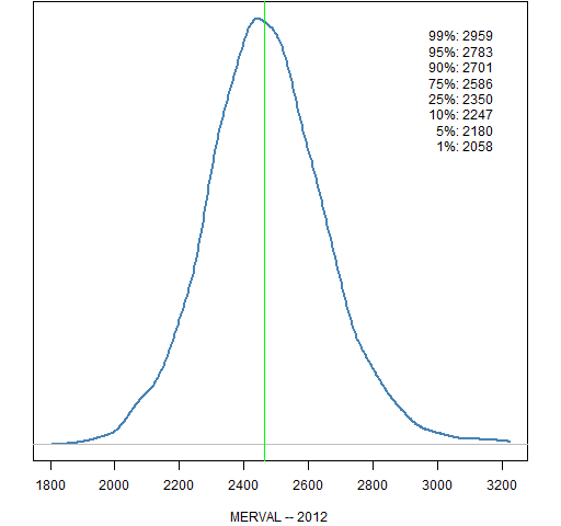
Europe
Figure 15: FTSE 100 (UK) 2011 prediction distribution. 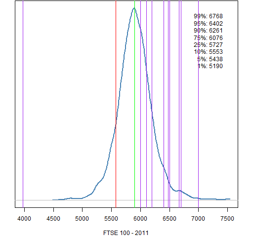
Figure 16: FTSE 100 (UK) 2012 prediction distribution. 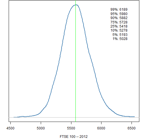
Figure 17: CAC 40 (France) 2011 prediction distribution. 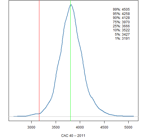
Figure 18: CAC 40 (France) 2012 prediction distribution. 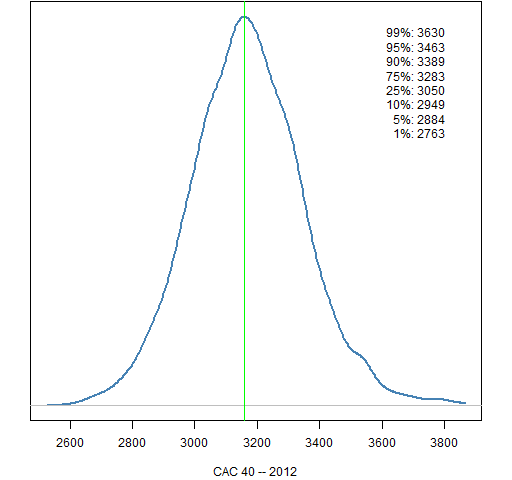
Figure 19: DAX (Germany) 2011 prediction distribution. 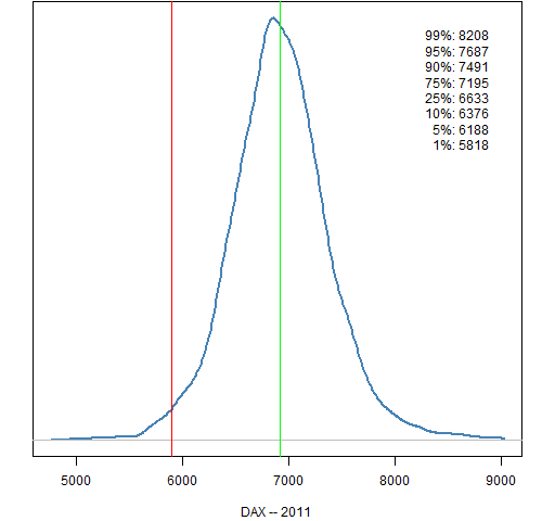
Figure 20: DAX (Germany) 2012 prediction distribution. 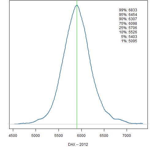
Figure 21: AEX (Netherlands) 2011 prediction distribution. 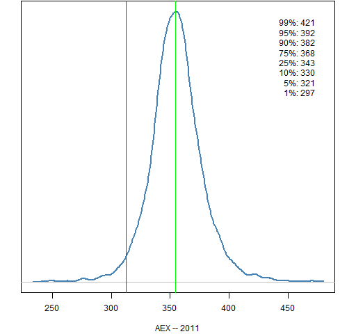
Figure 22: AEX (Netherlands) 2012 prediction distribution. 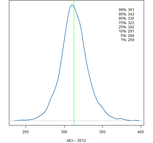
Figure 23: IBEX 35 (Spain) 2011 prediction distribution. 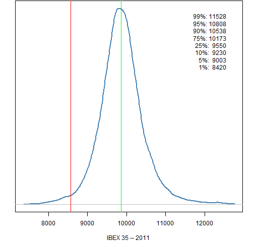
Figure 24: IBEX 35 (Spain) 2012 prediction distribution. 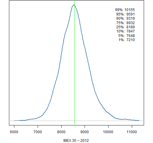
Figure 25: Euro Stoxx 50 (Europe) 2011 prediction distribution. 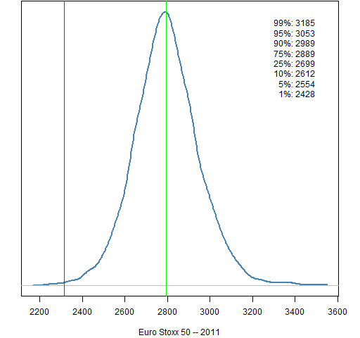
Figure 26: Euro Stoxx 50 (Europe) 2012 prediction distribution. 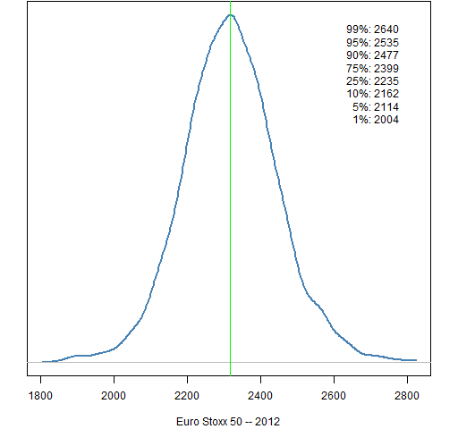
The East
Figure 27: Nikkei 225 (Japan) 2011 prediction distribution. 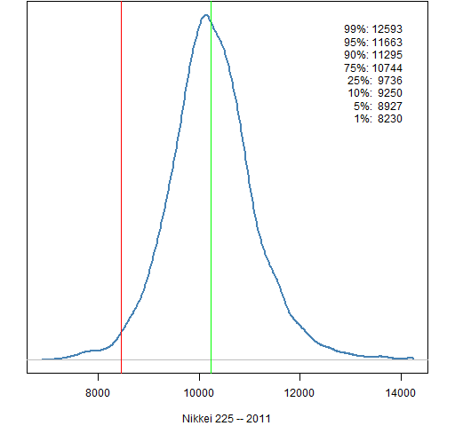
Figure 28: Nikkei 225 (Japan) 2012 prediction distribution. 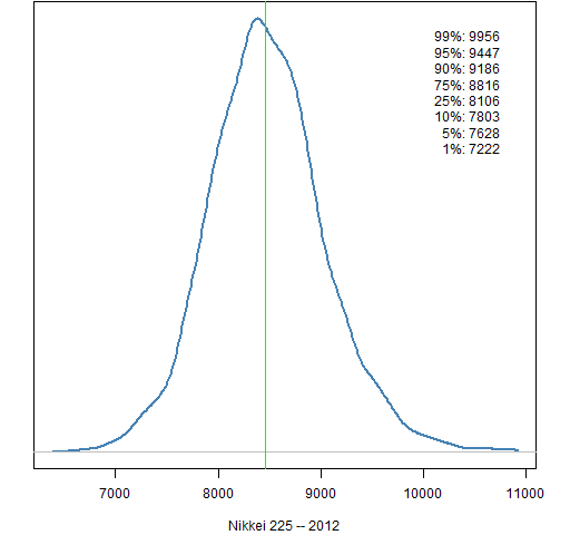
Figure 29: Hang Seng (Hong Kong) 2011 prediction distribution. 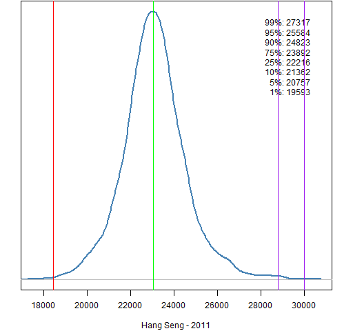
Figure 30: Hang Seng (Hong Kong) 2012 prediction distribution. 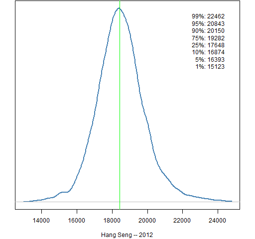
Figure 31: Shanghai Composite (China) 2011 prediction distribution. 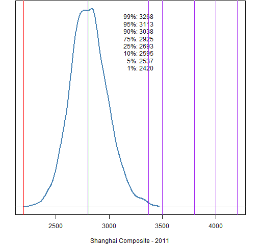
Figure 32: Shanghai Composite (China) 2012 prediction distribution. 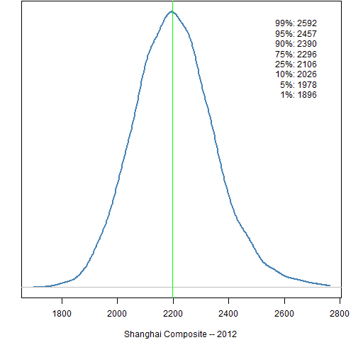
Figure 33: Straits Times (Singapore) 2011 prediction distribution. 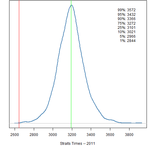
Figure 34: Straits Times (Singapore) 2012 prediction distribution. 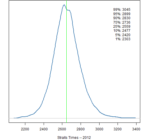
Figure 35: All Ordinaries (Australia) 2011 prediction distribution. 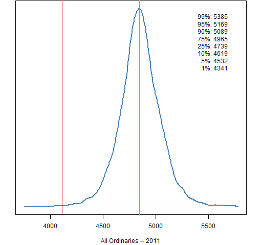
Figure 36: All Ordinaries (Australia) 2012 prediction distribution. 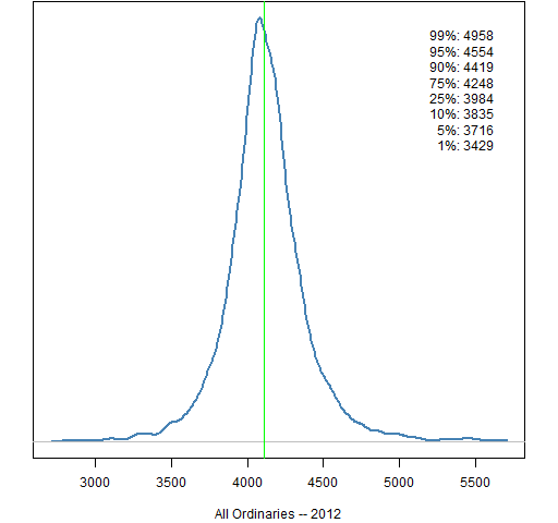
Figure 37: Sensex (India) 2011 prediction distribution. 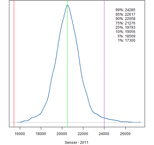
Figure 38: Sensex (India) 2012 prediction distribution. 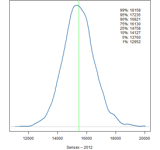
Oil price
Figure 39: Cushing OK contract 1 (US dollar) 2011 prediction distribution. 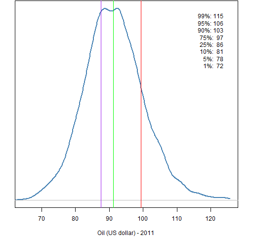
Figure 40: Cushing OK contract 1 (US dollar) 2012 prediction distribution. 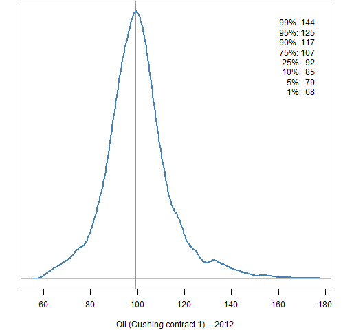
Methodology
- start with 8 or 9 years of returns
- take out an (excessively volatile) expected return at each point in time
- fit a GARCH(1,1) model
- simulate the garch model 250 trading days ahead starting with the current state (done 5000 times)
The simulation uses 50-day blocks. That is, for each simulated year 5 continuous blocks of length 50 are randomly selected from the standardized residuals from the garch model. With probability one-half the signs of all of the values in a block are switched — either all or none of the signs in the block are switched. This is meant to work around the autocorrelation in the residuals that is induced by fitting the overly rough expected returns.
Data sources
The stock data comes from Yahoo.
The oil data comes from http://www.eia.gov/dnav/pet/hist/LeafHandler.ashx?n=pet&s=rclc1&f=d
Appendix R
The commands to do the computing and creation of the 2012 plots is in prediction_dist2.Rscript.
The commands to draw the 2011 plots is in yearend_2011.Rscript.
These depend on the functions defined in prediction_dist_funs2.R. Some of the functions have been revised from last year. In particular some functions have had the default for their year argument changed to 2012.
The source function can be used in R, for instance:
source('https://www.portfolioprobe.com/R/blog/prediction_dist_funs2.R')
Pingback: Trading using Garch Volatility Forecast « Systematic Investor
Pingback: Popular posts 2012 May | Portfolio Probe | Generate random portfolios. Fund management software by Burns Statistics
Pingback: Popular posts 2012 July | Portfolio Probe | Generate random portfolios. Fund management software by Burns Statistics
Pingback: The shadows and light of models | Portfolio Probe | Generate random portfolios. Fund management software by Burns Statistics
Pingback: Popular posts 2012 March | Portfolio Probe | Generate random portfolios. Fund management software by Burns Statistics
Pingback: Market predictions for year 2013 | Portfolio Probe | Generate random portfolios. Fund management software by Burns Statistics