A data analysis surprise party.
Simple question
If I have correlation matrices each estimated with a month of daily returns, how much worse is the average of six of those compared to the estimate with six months of daily data?
Expected answer
Do a statistical bootstrap with the returns and compare the standard deviations across bootstrap samples for each correlation. This will show how much bigger the monthly standard deviations are compared to the daily standard deviations.
Return data
We use 126 daily (essentially 2012 H2) returns of 100 large cap US stocks. Figure 1 is a scatter plot of the 4950 correlations estimated with the two methods.
Figure 1: Correlations of returns estimated by mean monthly versus daily. 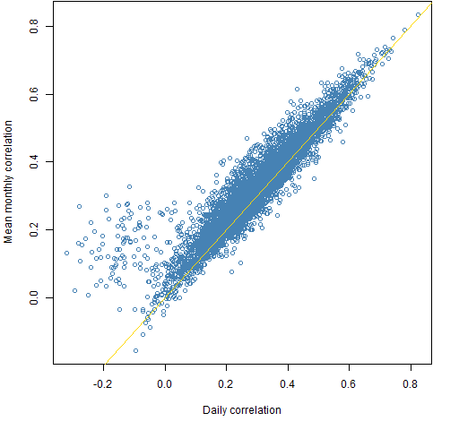
Surprise #1: Figure 1 is not boring.
Figure 2 compares the standard deviations of bootstraps of the two estimation methods.
Figure 2: Standard deviations across bootstrap samples of the monthly estimation versus daily estimation. 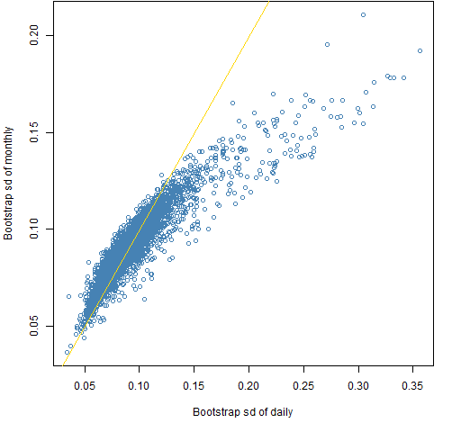
Surprise #2: The wrong estimator tends to be more variable.
Random normal data
We can experiment: Create new data shaped like our original data but that is randomly generated as multivariate normal with correlation equal to the daily estimate.
Figure 3 is like Figure 1 but for the normal data.
Figure 3: Correlation estimates: monthly versus daily for the randomly generated normal data. 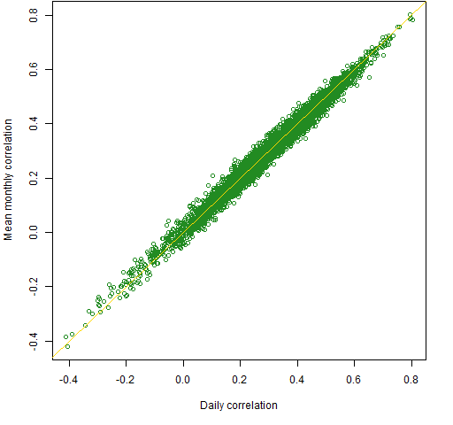
Semi-surprise #1: Figure 3 is boring, unlike Figure 1.
We know that the bootstrap is appropriate for the normal data: the observations are independent and identically distributed — perfect for the bootstrap. Figure 4 is the normal data version of Figure 2.
Figure 4: Standard deviations across bootstrap samples of the monthly estimation versus daily estimation of the randomly generated normal data. 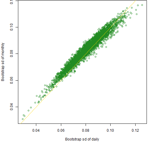
Now that we have fake data for which we actually know the true value of the correlations, we can look at the mean squared error of the estimates. This is done in Figure 5.
Figure 5: Mean squared errors (MSE) across bootstrap samples of the monthly estimation versus daily estimation of the randomly generated normal data. 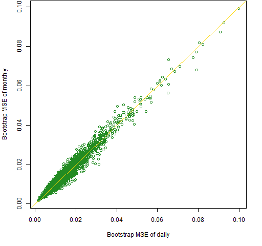
Surprise #3: There’s hardly any difference at all between the quality of the two estimates for the normal data.
Back to reality
We can highlight the correlations where the two methods differ significantly, as shown in Figure 6.
Figure 6: Correlations estimated by mean monthly versus daily with strange points highlighted (in magenta). 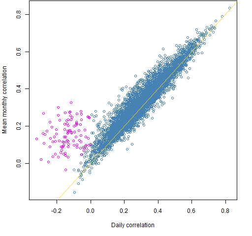
Figure 7 shows where those highlighted points show up in the plot of bootstrap standard deviations.
Figure 7: Standard deviations across bootstrap samples of the monthly estimation versus daily estimation with correlation outliers highlighted. 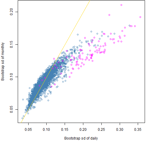
Surprise #4: The disagreement over negative daily correlations does not explain the relatively low variability of the monthly estimates — at least not entirely.
Note that both standard deviations for the real data tend to be larger than for the normal data.
We can define weird the other way around: define extreme in terms of the bootstrap standard deviations and then see where those show up in the correlation scatterplot. This is Figures 8 and 9.
Figure 8: Standard deviations across bootstrap samples of the monthly estimation versus daily estimation with standard deviation outliers highlighted. 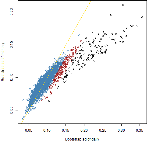
Figure 9: Correlations estimated by mean monthly versus daily with standard deviation outliers highlighted. 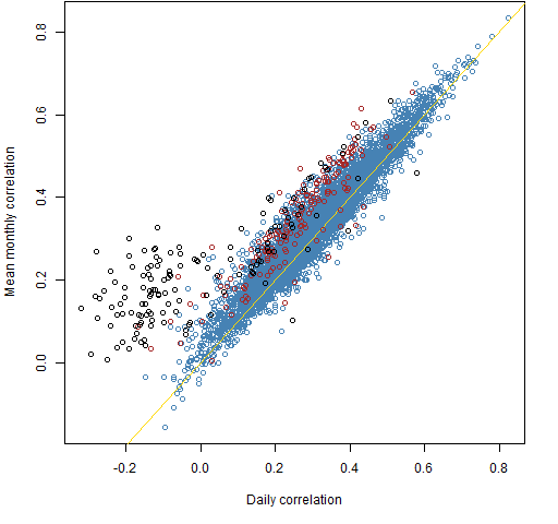
Summary
I don’t know what is going on. There is some sort of dependence that is showing up in the correlations of the returns. Part of the puzzle is probably that return correlations (and means) are not constant through time.
Epilogue
Complications in the air
Complications in the forecast now
Complication everywhere
from “Complications” by Steve Forbert
Appendix R
daily correlation estimate
Getting the correlation matrix using daily data is easy enough:
corDay <- cor(retmat6m)
mean monthly estimate
A little more goes into our monthly estimate. The first thing we do is create a three dimensional array to hold the six monthly estimates:
corMons <- array(NA, c(100, 100, 6),
   c(dimnames(corDay), list(NULL)))
Note that c is used to put two lists together.
Then we compute the correlations in each month:
dseq <- 1:21
for(i in 1:6) {
   corMons[,,i] <- cor(retmat6m[dseq + (i-1) * 21,])
}
Finally, we average the correlations, ending up with a matrix:
corMM <- apply(corMons, 1:2, mean)
(There is a chapter in S Poetry about higher dimensional arrays that may be of use if you start working with them.)
scatter plot
We just want one copy of the off-diagonal values in the correlation matrix. We can get a logical vector selecting the lower triangle with:
clt <- lower.tri(corDay, diag=FALSE)
(The default value of diag is FALSE, but I typically include diag in my calls to lower.tri just to make sure I have it the right way around without looking.)
This is used like:
plot(corDay[clt], corMM[clt])
write a simple function
We can write a little function that does the mean monthly correlation estimate:
pp.cor6m <- function(x)
{
   mc <- array(NA, c(ncol(x), ncol(x), 6))
   dseq <- 1:21
   for(i in 1:6) {
      mc[,,i] <- cor(x[dseq + (i-1) * 21,])
   }
   apply(mc, 1:2, mean)
}
bootstrap correlations
We start off again by creating arrays that we will then populate:
bootcord <- bootcorm <- array(NA, c(100, 100, 200))
Now do the actual bootstrapping:
for(i in 1:200) {
   bx <- retmat6m[sample(126, 126, replace=TRUE),]
   bootcord[,,i] <- cor(bx)
   bootcorm[,,i] <- pp.cor6m(bx)
}
Finally, get the standard deviation across the bootstrap estimates for each correlation:
bootd.sd <- apply(bootcord, 1:2, sd)
bootm.sd <- apply(bootcorm, 1:2, sd)
generate normal data
There is a function in the MASS package for generating random multivariate normal data.
require(MASS)
This is used like:
normmat <- mvrnorm(126, mu=rep(0,100), Sigma=corDay)
bootstrap MSE
The bootstrapping is:
nbtcord <- nbtcorm <- array(NA, c(100, 100, 200))
for(i in 1:200) {
   bx <- normmat[sample(126, 126, replace=TRUE),]
   nbtcord[,,i] <- cor(bx)
   nbtcorm[,,i] <- pp.cor6m(bx)
}
Then the mean squared errors are calculated like:
nbtd.mse <- apply(nbtcord - as.vector(corDay), 1:2,
                  function(x) mean(x^2))
The as.vector is used because there is an error otherwise. When arithmetic is done on arrays in R, there is a check to see if they are conformable. A matrix and a three dimensional array are not conformable. Removing the matrixness of corDay allows the computation to proceed, and it is the right computation in this case.
define strange
When looking at Figure 1 we have a sense of which points are weird. There are multiple ways to translate our intuition into a definition. Here is the one I used:
corMM[clt] - corDay[clt] > .1 & corDay[clt] < 0
That is, the monthly estimate needs to be at least 0.1 bigger than the daily estimate and the daily estimate must be negative.
The definitions of weird in the other direction are:
wei <- bootd.sd[clt] - bootm.sd[clt] > .02
wei2 <- bootd.sd[clt] - bootm.sd[clt] > .04
This is a great and interesting post, however I think that your language is misleading.
You oppose several times “monthly vs daily”, but if I understand correctly, underlying returns are always daily returns.
So it is not really daily against monthly, but full sample vs average of sub samples.
Did I misunderstood ?
You did not misunderstand. And your description is probably more clear to a lot of people.
Thanks.
I suspect this is due to daily data’s mean-reversion for those “black data points”. You can refer to “Variance Ratio Test”
In theory, if a timeseries X has no autocorrelation and each points are independent of the other, then if you divide X by two different frequency, i.e. daily and monthly, you should have:
Variance ( X_monthly ) = Variance (X_day1) + Variance (X_day2) + … + Variance (X_day20) = 20 x Variance (X_daily)
So linear relationship and this is what those BLUE data points means on your graph.
However, if X is mean-reverting on a daily basis, then the formula becomes:
Variance ( X_monthly ) = Variance (X_day1) + Variance (X_day2) + … + Variance (X_day20) + Cov(day1, day2) + Cov(day2, day3) + …. + Cov(day19, day20) = 20 x Varianace(X_daily) + Autocovariance < 20 x Varianace(X_daily)
Bc if X is mean-reverting daily, Autocovariance is negative.
Therefore the linear relationship coefficient is no longer 20 !!! This shows up as "Black data points", whose coefficient is different versus "Blue"
You can implement a trading strategy to only do Mean-reverting trade on “Black points” and see if after Transaction-cost, if those “Black point” stocks and make money by “buy if stock falls too much today, sell if rises too high”