How has the distribution of correlations changed over the last several years?
Previously
Data
Daily returns of 443 large cap US stocks from 2004 through 2012 were used. The sample correlations — almost 98,000 of them — during each year were created.
If we were actually using the correlations, then we would probably want to use some adjustment of the sample correlations. The most common tweaks are:
- shrinkage, such as Ledoit-Wolf shrinkage
- a factor model
However, here we really are interested in the sample correlations.
Pictures
Figure 1 shows boxplots for each year. 2012 is the first post-2008 year in which the correlations approach the pre-crash values.
Figure 1: Distribution of correlations by year. 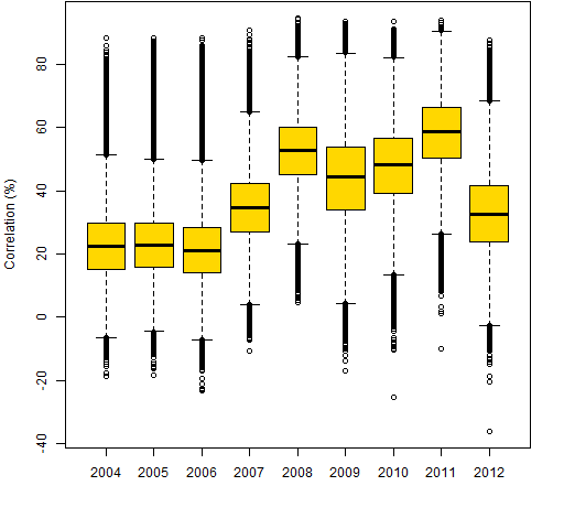 Figures 2 through 9 are scatterplots from one year to the next. They are shown as smoothed scatterplots because of the large number of points in each plot. The gold line in these plots shows where the correlations are unchanged.
Figure 2: Individual correlations from 2004 to 2005. 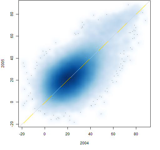
Figure 3: Individual correlations from 2005 to 2006. 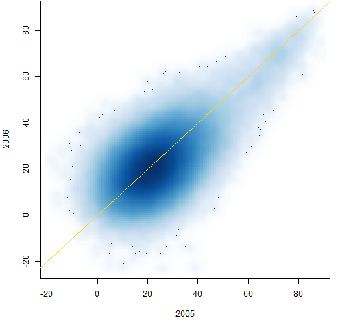
Figure 4: Individual correlations from 2006 to 2007. 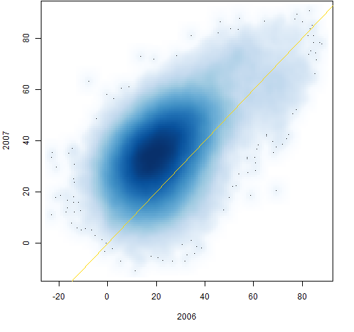
Figure 5: Individual correlations from 2007 to 2008. 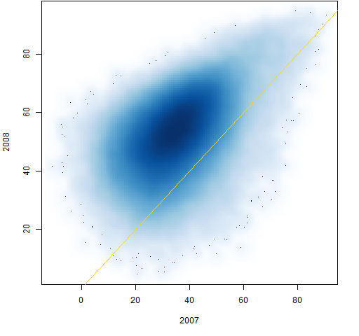
Figure 6: Individual correlations from 2008 to 2009. 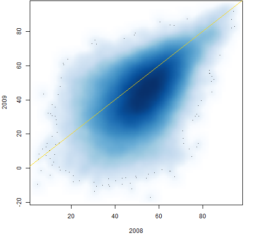
Figure 7: Individual correlations from 2009 to 2010. 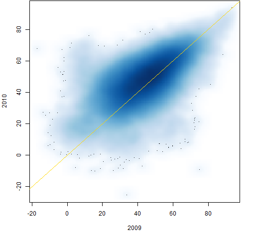
Figure 8: Individual correlations from 2010 to 2011. 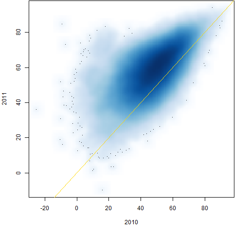
Figure 9: Individual correlations from 2011 to 2012. 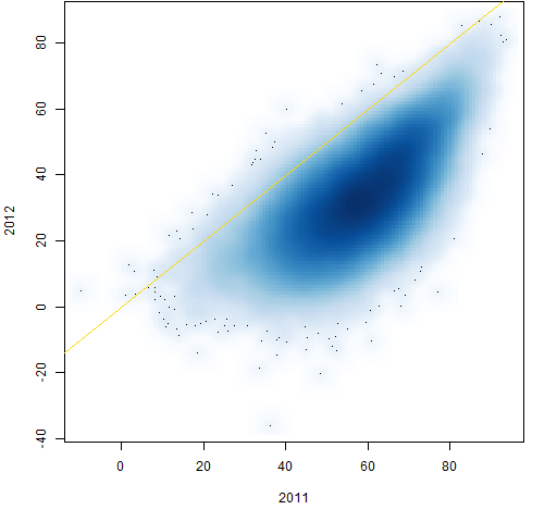
Figure 10 shows the transition from 2004 to 2012. It has a comet tail at the top.
Figure 10: Individual correlations from 2004 to 2012. 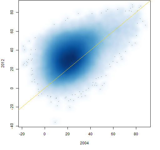 Figure 11 shows the path through time of 100 randomly selected correlations.
Figure 11: 100 correlation paths selected at random. 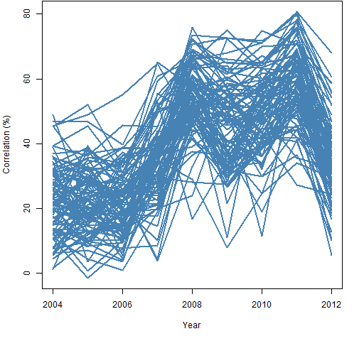
Figure 10 suggests that correlations that are above 60% in 2004 are still unusually large in 2012. There happened to be 712 correlations larger than 60% in 2004. Figure 12 shows a random sample of 100 of them. Figure 13 is a random sample from the 712 correlations that were smallest in 2004.
Figure 12: 100 correlation paths selected at random given the 2004 correlation is at least 60%. 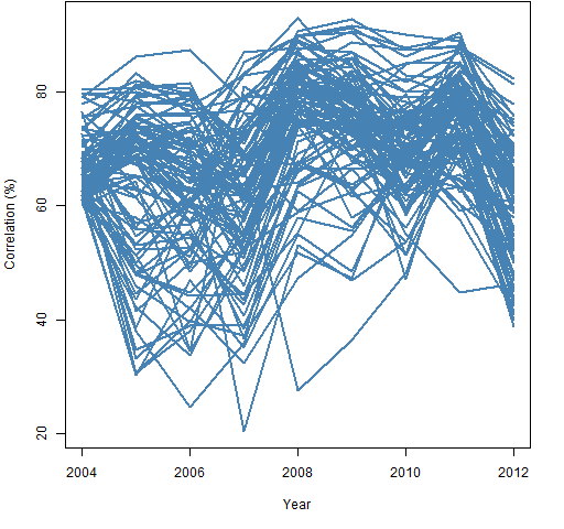
Figure 13: 100 correlation paths selected at random from the 712 smallest correlations in 2004. 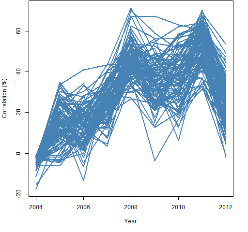 Figures 12 and 13 show the small correlations regressing towards the center much more than the large correlations. Figure 14 shows this also.
Figure 14: Distributions of 2012 correlations: all of them, the 712 largest in 2004 and the 712 smallest in 2004. 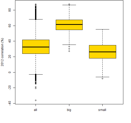
Calibration
A few new correlation matrices were created from bootstrapped samples of the 2012 returns. Figure 15 compares the correlations from the 2012 returns and the first bootstrap sample (which is typical).
Figure 15: Individual correlations from 2012 and a bootstrap of 2012. 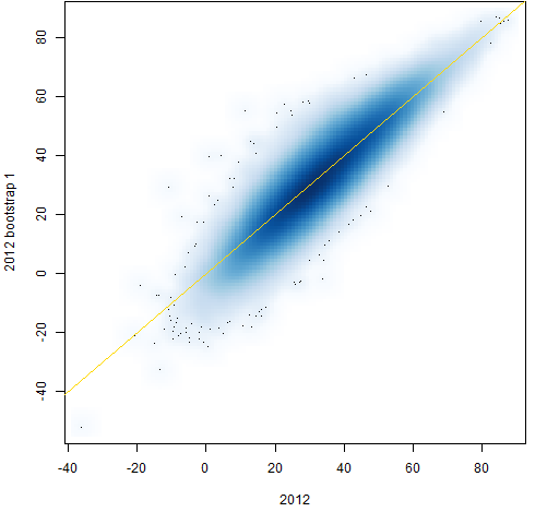 This shows slightly more variability for the small correlations than the large ones, but not nearly so much as with the real data. Figure 15 shows pure sampling error while the previous plots have sampling error plus actual changes to the correlations.
Summary
It appears that large correlations are more stable than smaller ones. That’s not so hard for me to believe.
Appendix R
Computations were done in R.
prepare returns
The initclose object is a matrix of daily closing prices (days in rows, stocks in columns). We get log returns with:
initret <- diff(log(initclose))
retyear <- substring(rownames(initret), 1, 4)
The second command gives us the year of each row in the return matrix.
lower triangle
We will start with a full correlation matrix, which has two copies of each correlation plus a diagonal of ones. We want one copy of just the correlations, hence we’ll extract the lower triangle of the correlation matrices. In preparation we do:
ltri <- lower.tri(cor(initret[1:100,]), diag=FALSE)
The actual matrix that we use inside lower.tri doesn’t matter — we just need it to be the right size. The result is an object that is TRUE for lower triangle positions and FALSE otherwise.
create correlations
The strategy is to create a matrix to hold the 9 years of correlations, and then to fill it:
corYear <- array(NA, c(sum(ltri), 9),
   list(NULL, 2004:2012))
for(i in 2004:2012) {
   tcor <- cor(initret[retyear == i,])
   corYear[, as.character(i)] <- tcor[ltri]
}
The one tricky bit here is the as.character(i) which is used so that we get the column named "2004" rather than column number 2004.
boxplot
The command to create Figure 1 was:
boxplot(corYear * 100, col="gold", ylab="Correlation (%)")
smoothed scatterplot
The smoothed scatterplots were created with commands like:
smoothScatter(100 * corYear[,1:2])
abline(0,1, col="gold")
bootstrap
The bootstrapping of the 2012 correlations was done with:
initret12 <- initret[retyear == 2012, ]
corboot12 <- array(NA, c(sum(ltri), 10))
for(i in 1:10) {
  tret <- initret12[sample(250, 250, replace=TRUE), ]
  corboot12[,i] <- cor(tret)[ltri]
}
Pretty much trivial as long as you know the incantation for the sample function.
Pingback: Blog year 2013 in review | Portfolio Probe | Generate random portfolios. Fund management software by Burns Statistics