Comparing the behavior of the two on the S&P 500.
Previously
There have been a few posts about Value at Risk (VaR) and Expected Shortfall (ES) including an introduction to Value at Risk and Expected Shortfall.
Data and model
The underlying data are daily returns for the S&P 500 from 1950 to the present.
The VaR and ES estimates are 500-day historical with a one-day horizon and 95% probability level. They were calculated every 20 trading days.
VaR relative to ES
Figure 1 shows the VaR and ES estimates through time on the scale of percent returns.
Figure 1: 95% VaR (blue) and ES (gold) for the S&P 500 through time. 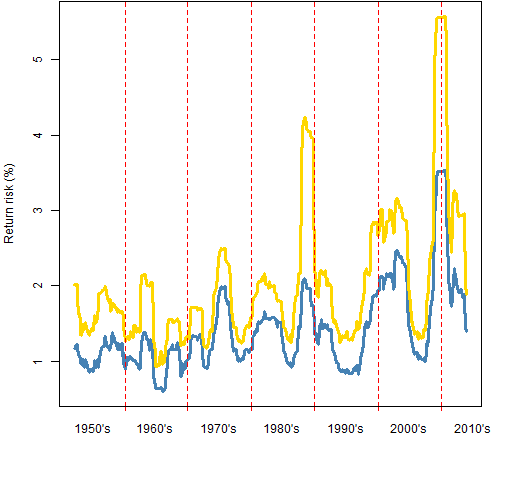
The last time of estimation was 2013 October 31 and had the lowest values for the last few years. The last time the VaR was lower was in November 2007.
Figure 2 plots the ratio of the series in Figure 1.
Figure 2: Ratio of the 95% ES to the VaR for the S&P 500 through time. The gold line shows the ratio under the normal distribution.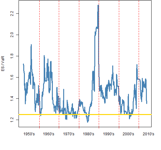
If you have a parametric model, then one way of thinking about Expected Shortfall is that it is just a constant times the Value at Risk. “The scaling of Expected Shortfall” shows that the ratio for the normal distribution is about 1.25.
The ratio of the values is not especially correlated with their levels. For example, the ratio is near the value for the normal during the 70’s but elevated during the quiet period of the 90’s.
Variability of VaR and ES
At each time point that the VaR and ES were calculated their interquartile ranges were estimated with a statistical bootstrap. Figure 3 shows the interquartile ranges (again in terms of percent returns) over time.
Figure 3: Interquartile ranges of VaR (blue) and ES (gold) for the S&P 500 through time. 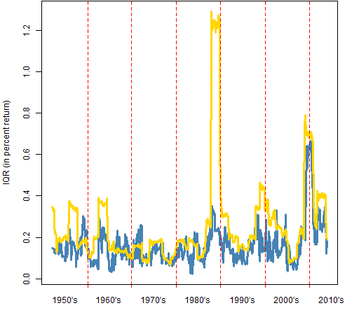
Except for the spike in the late 80’s — which we’ll discuss shortly — the variability of the VaR and the ES tend to be fairly similar. It is natural for the variability of ES to be slightly higher since ES is slightly bigger.
Figure 4 plots the IQR of VaR divided by the level of Var in blue. Similarly the gold line is the IQR of ES divided by ES.
Figure 4: the ratio of the IQR to the level of VaR (blue) and ES (gold). 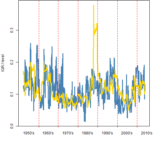
What does it mean that the IQR ratio is about 0.1? When that is the case, then there are at most 2 significant digits among the central 50% of the estimates.
Why does the ratio spike up at the end of the 80’s for ES? First is a conceptual answer, then a more data-driven answer is given farther below.
The specific cause is the crash of 87. While the crash is in the estimation window, the tail is estimated to be quite long. The length of the tail has a big impact on the Expected Shortfall. The longer the tail, the more uncertain the length of the tail is. Hence the uncertainty of the Expected Shortfall goes up when crashes are in the estimation window.
Nerdspeak
One bootstrap was performed by sampling the 500 returns 500 times with replacement, and then computing the VaR and ES on that new sample. 5000 bootstrap samples were created at each time point.
Why does the ratio spike up at the end of the 80’s for ES? The specific cause is the crash of 87 — there is a daily return on the order of -20%.
The value of the ES for the bootstrap samples will depend a whole lot on how many copies of that outlying return are in the sample. If there is one copy, then the bootstrap ES will probably be close to the original ES. If there are no copies, it will be smaller. If there are two or more copies it will be much bigger.
A single large outlier makes it apparent that the bootstrap is a rather blunt tool for this job. However, I don’t think it misleads us.
All of the figures exhibit the fact that the Expected Shortfall is not statistically robust — one outlying value has a big impact. In contrast, Value at Risk does have some robustness.
Summary
Thinking the accuracy of historical Value at Risk or Expected Shortfall is better than two significant digits is delusional. That is true even assuming the historical model is perfect. The lack of responsiveness of the historical estimates means they are substantially less accurate than that.
The variability of Value at Risk and Expected Shortfall are similar enough that there is probably no reason to prefer one over the other on that basis.
Appendix R
Computations and plots were done in R.
function to do estimation
This function depends on two functions given in the blog post “The estimation of Value at Risk and Expected Shortfall”. By default those functions only report two significant digits.
pp.varesSpread <- function(rets, prob=.05, trials=5000)
{
    lr <- length(rets)
    varboot <- esboot <- numeric(trials)
    for(i in 1:trials) {
       tret <- sample(rets, lr, replace=TRUE)
       varboot[i] <- VaRhistorical(tret, prob=prob,
          digits=15)
       esboot[i] <- EShistorical(tret, prob=prob,
          digits=15)
    }
    c(VaR=VaRhistorical(rets, prob=prob, digits=15),
       ES=EShistorical(rets, prob=prob, digits=15),
       IQRvar=unname(diff(quantile(varboot, c(.25, .75)))),
       IQRes=unname(diff(quantile(esboot, c(.25, .75)))))
}
estimate through time
The function just given was used thus:
evTimes <- seq(501, length(spxret), by=20)
evSpreadMat <- array(NA, c(length(evTimes), 4),
   list(names(spxret)[evTimes],
   names(pp.varesSpread(tail(spxret, 500)))))
evSeq <- -500:-1

for(i in 1:length(evTimes)) {
 evSpreadMat[i,] <- pp.varesSpread(spxret[
    evSeq + evTimes[i]])
 cat(".")
 if(i %% 50 == 0) cat("\n")
}
Pingback: Historical Value at Risk versus historical Expected Shortfall - R Project Aggregate