What’s that thing about arithmetic and geometric returns and the variance?
Previously
An introduction to the difference between simple and log returns is:
Issue
Suppose you are predicting the mean annual return of an asset for some number of years. To simplify the discussion, let’s buy into the fantasy that the observed returns are a good (unbiased) estimate of future returns. If you take the mean of the historical simple returns, you will be over-estimating the mean return — call this “Amean” (as in arithmetic mean). Better is to take the mean of the log returns and then transform that mean into a simple return — call this “Gmean”.
The approximation of Gmean using only simple returns is Amean minus half the variance of the historical simple returns.
Perhaps others will disagree but I don’t think the issue is computational — if someone can compute a variance, they should just about be able to take a logarithm. I think the issue is of how we think rather than how we compute. It is easy to get optimistic.
“On the relationship between Arithmetic and Geometric Returns” explains where the approximation comes from, and discusses three more as well.
Pictures
We’ll investigate a world in which the true annual return each year is 5% and the volatility is 20%.
What varies is the distribution of returns and the length of the history available.
The other constant is that we always look at 1000 realizations of a simulation.
normal decade
Figures 1 through 3 show the simulations where the log returns have a normal distribution and we have a decade of data (that is, 10 annual returns).
Figure 1: Amean versus Gmean for a decade with the normal distribution. 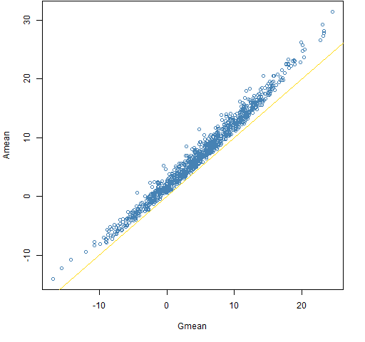
Figure 2: Amean minus Gmean versus Gmean for a decade with the normal distribution. 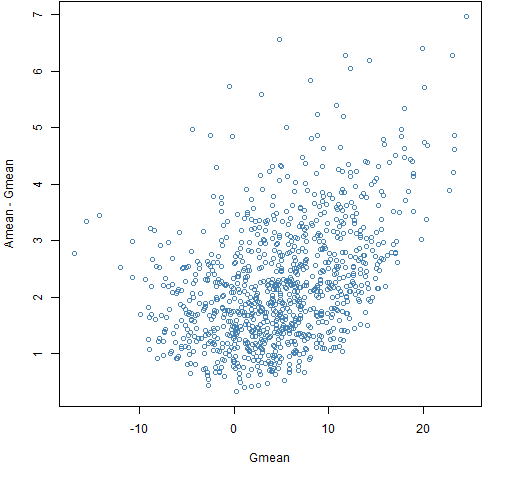 The bias in Amean relative to Gmean is always non-trivial in this case and often quite significant.
Figure 3: The approximation minus Gmean versus Gmean for a decade with the normal distribution. 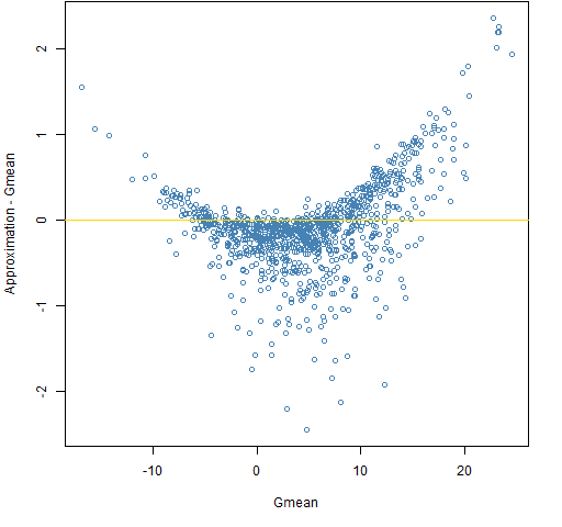 The approximation is pretty much unbiased, but it can be substantially far from Gmean.
Remember that the true answer in all cases is 5 — it is just that Gmean is pretty much our best guide if we don’t get to know the secrets of the universe.
t6 decade
Figures 4 through 6 show the simulations from a decade of data where the distribution of daily returns is the t with 6 degrees of freedom.
Figure 4: Amean versus Gmean for a decade with the t6 distribution. 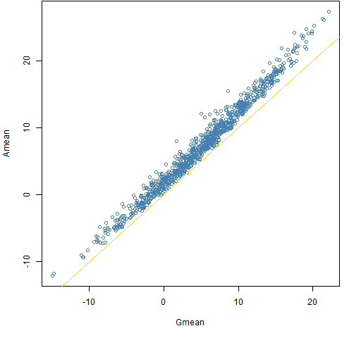
Figure 5: Amean minus Gmean versus Gmean for a decade with the t6 distribution. 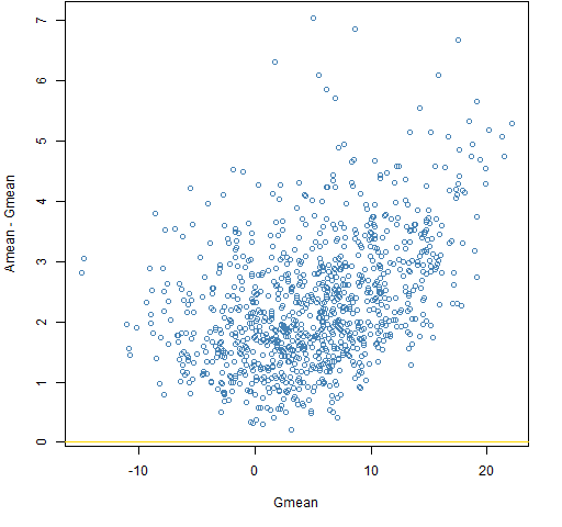
Figure 6: The approximation minus Gmean versus Gmean for a decade with the t6 distribution. 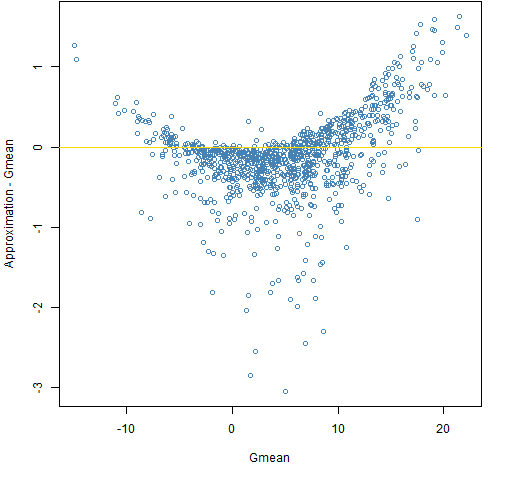 There are some differences between the normal and t6 cases, but they are fairly subtle. A more realistic change in return distribution would be to put in volatility clustering. That probably would give significantly different results from the normal case.
normal century
Figures 7 through 9 show the simulations assuming a century of data and normally distributed returns.
Figure 7: Amean versus Gmean for a century with the normal distribution. 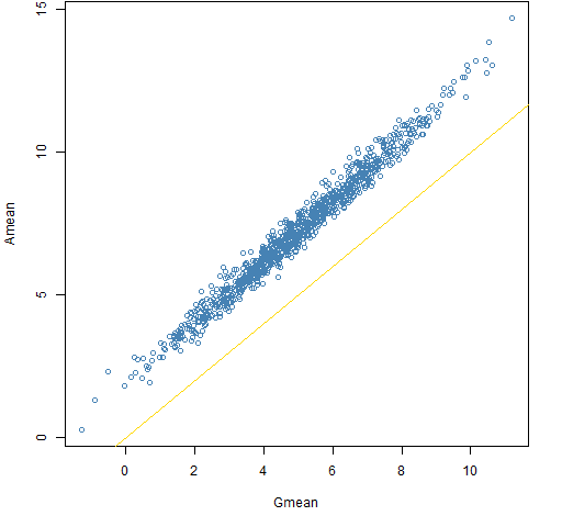
Figure 8: Amean minus Gmean versus Gmean for a century with the normal distribution. 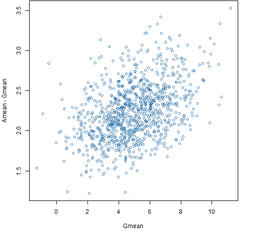
Figure 9: The approximation minus Gmean versus Gmean for a century with the normal distribution. 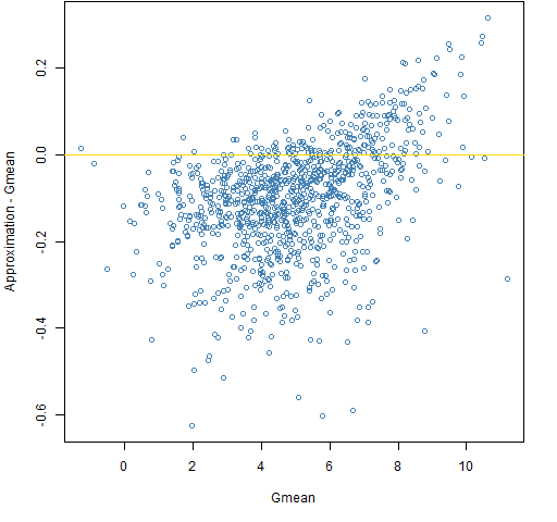 Even though the true mean return is 5% there are a few centuries out of 1000 that experienced a negative return. Awesome.
normal millennium
Figures 10 through 12 show simulations assuming a thousand years of data and normally distributed returns.
Figure 10: Amean versus Gmean for a decade with the millennium distribution. 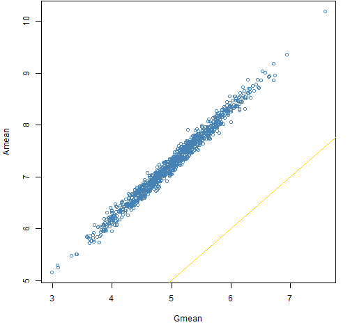
Figure 11: Amean minus Gmean versus Gmean for a millennium with the normal distribution. 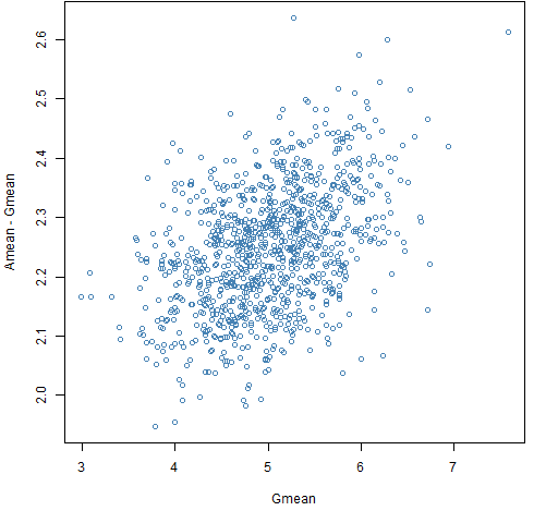
Figure 12: The approximation minus Gmean versus Gmean for a millennium with the normal distribution. 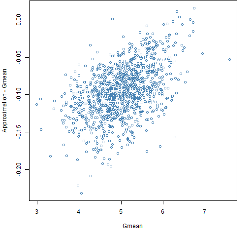
Summary
Be careful when averaging returns.
We have no claim to know what’s right. That is, we don’t have a chance in hell of knowing the true expected return of equities.
Epilogue
Oh my fair North Star
I have held to you dearly
I have asked you to steer me
from “Mercy of the Fallen” by Dar Williams
Appendix R
The simulations were performed in R.
simulation function
The function that produced the simulations was:
pp.simulret <- function(years, meanann, vol,
   distribution="normal", trials=1000, ...)
{
  # simulate years of returns based on daily returns

  # placed in the public domain 2013 by Burns Statistics

  # testing status: untested

  dots <- list(...)
  if(length(dots)) {
    df <- dots$df
  }

  ans <- array(NA, c(trials, 4), list(NULL,
            c("Amean", "Gmean", "Var", "approx")))
  for(i in 1:trials) {
    switch(distribution,
           normal={
             logret <- rnorm(years * 252, meanann/25200,
                             vol/100/sqrt(252))
           },
           t={
             logret <- rt(years * 252, df=df) *
               sqrt((df-2)/df) * vol/100/sqrt(252) +
               meanann/25200
           })
    logret
    annlret <- colSums(matrix(logret, nrow=252))
    annsret <- (exp(annlret) - 1)
    ans[i,-4] <- c(mean(annsret), mean(annlret),
        var(annsret))
  }
  ans[,4] <- ans[,1] - ans[,3]/2
  ans[, -3] <- ans[,-3] * 100
  ans
}
It is used like:
sim.norm.decade20 <- pp.simulret(10, 5, 20,
   dist="normal")
plot function
The function to do the plots was:
pp.simulretplot <- function(x, type, ...)
{
  # plots for simulated returns

  # placed in the public domain 2013 by Burns Statistics

  # testing status: untested
  switch(type,
         gam={
           plot(x[, "Gmean"], x[, "Amean"],
              col="steelblue", xlab="Gmean",
              ylab="Amean", ...)
           abline(0, 1, col="gold")
         },
         ram={
           plot(x[, "Gmean"], x[, "Amean"]-x[, "Gmean"],
              col="steelblue", xlab="Gmean",
              ylab="Amean - Gmean", ...)
           abline(h=0, col="gold")
         },
         gap={
           plot(x[, "Gmean"], x[, "approx"],
              col="steelblue", xlab="Gmean",
              ylab="Approximation", ...)
           abline(0, 1, col="gold")
         },
         rap={
           plot(x[, "Gmean"], x[, "approx"]-x[, "Gmean"],
              col="steelblue", xlab="Gmean",
              ylab="Approximation - Gmean", ...)
           abline(h=0, col="gold")
         })
}
Figures 1, 2 and 3 were produced with:
pp.simulretplot(sim.norm.decade20, 'gam')
pp.simulretplot(sim.norm.decade20, 'ram')
pp.simulretplot(sim.norm.decade20, 'rap')
Another fabulously intriguing post. Why does the plot of 1000 years worth of approximate Gmean vs Gmean lose the structure that 10 and 100 years had? Presumably something do with the accuracy of the approximation to Gmean, but I don’t understand the shape. Is to do with the different rates of convergence of estimates of mean and variance of simple returns??
Keiran,
Yes, that is my interpretation: that we are basically seeing the same pattern, but we only see a tiny slice of it. In the link I gave, he talks about one of the other approximations being exact for the normal case. Looking at that would probably give a clue of what goes wrong with this approximation.
Pingback: Daily Wrap for 5/12/2013 | The Whole Street