An exploration of the usefulness of sectors.
Previously
This subject was discussed in “S&P 500 sector strengths”.
Idea
Stocks are put into groups based on the sector that the company is considered to be in. Cluster analysis is a statistical technique that finds groups. If sectors really move together, then clustering should recover sectors. Will it?
Data
The data were the 2012 returns of the set of stocks with full data for the year and known sector from the US market portraits. This was 453 US large capitalization equities.
Table 1 gives the number of stocks in each sector for this set of equities.
Table 1: The sectors and the number of stocks in each.
| Sector | number of stocks |
|---|---|
| Telecommunications Services | 7 |
| Materials | 30 |
| Utilities | 31 |
| Consumer Staples | 33 |
| Energy | 34 |
| Health Care | 46 |
| Industrials | 59 |
| Information Technology | 63 |
| Consumer Discretionary | 74 |
| Financials | 76 |
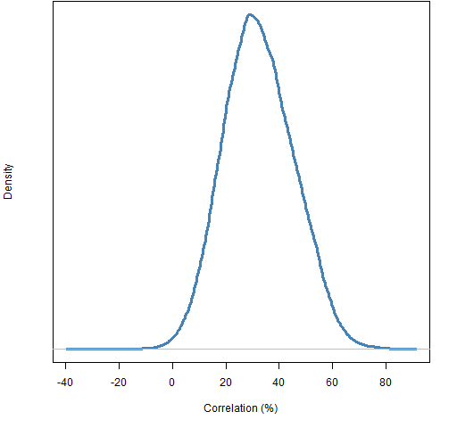
Clustering — the traditional variety at least — uses “distances” between objects. The distance between two stocks was taken to be one minus the correlation of the 2012 daily returns. The distribution of correlations is shown in Figure 1.
Figure 1: Distribution of estimated correlations of 2012 daily returns among the 453 stocks. 
Results
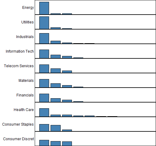
Figure 2 shows the fraction of stocks within each sector that fall into the same clusters.
Figure 2: Agreement of sector and cluster classifications. 
The sectors are sorted in the plot by the maximum fraction of stocks that fall into a single cluster. So “Energy” had the biggest percentage of its stocks in one cluster (about 88%) and had about 6% in each of two other clusters; that is, 30 stocks in one cluster and 2 stocks in each of two other clusters.
This plot has the same objective as Figure 1 in “S&P 500 sector strengths”. “Energy”, “Utilities”, “Industrials” and “Information Technology” have strong showings in both cases. There is not so much agreement with the other sectors, except that the two consumer sectors are weak in both cases.
This analysis is about individual correlations while the previous one is about mean correlation. A sector with some very high correlations and some weak correlations will probably look better in the previous analysis than the current one.
What can go wrong?
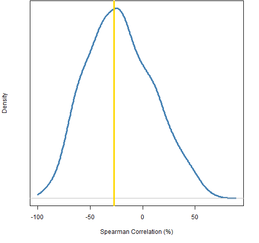
Sectors that have a large number of stocks in them are going to be more prone to be split up in the clustering than smaller sectors. Let’s see how much the order of the size of the sectors matches the order of the clustering — this can be done with the rank (or Spearman) correlation. Figure 3 shows the distribution of the rank correlation from randomly permuting the sector allocations, along with the correlation using the actual sector allocation.
Figure 3: Spearman correlation between sector size and maximum allocation to a cluster, randomly permuted sector allocation (blue), actual allocation (gold).  This plot tells us two things:
- we are very unlikely to learn much from this correlation
- there’s not even a hint that our clustering is anything but random
Or put another way, the plot pretty much only informs us of our ignorance.
Summary
Care should be taken with sectors (and industries and countries). Some sectors act as expected, but some probably act more like a random collection.
Epilogue
Whose woods these are I think I know
from “Stopping by Woods on a Snowy Evening” by Robert Frost
Appendix R
Here is an outline of the R commands that produced the analysis.
correlation
The command that created the correlation matrix was:
corsamp12 <- cor(retMat12[, !is.na(sector12)])
clustering
There are lots of clustering strategies. Several of them can be done via the hclust function. In most cases you’ll do pretty well if you just take the default settings of R functions if you are unfamiliar with a statistical technique. That’s not so true with clustering.
In this case many clustering methods put almost all the stocks into one category. That’s another way things can go wrong — if all stocks were in one cluster, then the sector allocations would look perfect.
The default method (complete) didn’t create one big cluster, even so Ward’s method was the one used here:
hclus12sampward <- hclust(as.dist(1 - corsamp12),
   method="ward")
grp12sampward <- cutree(hclus12sampward, k=10)
The first command does the clustering — note the use of as.dist to turn what is logically a distance matrix into a distance object that hclust is expecting. The second command uses the clustering object to decide how to form 10 clusters (groups).
clusters and sectors
The function to match up clusters and sectors is:
pp.secclust <- function(groups, sectors=sector12sub)
{
  # placed in public domain 2013 by Burns Statistics

  stopifnot(all(names(groups) == names(sectors)))
  tab <- table(groups, sectors)
  sweep(tab, 2, colSums(tab), FUN=`/`)
}
plotting
The function to do the plotting is:
pp.plotSecclust <- function(tabscale, labels=NULL,
                            col="steelblue", ...)
{
  # placed in public domain 2013 by Burns Statistics

  on.exit(par(oldpar))
  oldpar <- par(mfcol=c(ncol(tabscale), 1),
     mar=c(0,12,0,0) + .1)
  tabscale <- tabscale[, rev(order(apply(tabscale, 2,
     max)))]
  if(!length(labels)) {
    labels <- colnames(tabscale)
    names(labels) <- labels
  }
  for(i in 1:ncol(tabscale)) {
    thistab <- sort(tabscale[,i], decreasing=TRUE)
    barplot(thistab, ylim=c(0,1), col=col, axes=FALSE,
            names.arg=rep("", nrow(tabscale)), ...)
    mtext(side=2, labels[colnames(tabscale)[i]], las=1,
       adj=1)
    box()
  }
}
This is used like:
pp.plotSecclust(pp.secclust(grp12sampward),
  labels=secLabels)
rank correlation
The function to do permutation tests of the Spearman correlation on sector size is:
pp.secSpearPerm <- function(groups, sectors=sector12sub,
                            trials=1000)
{
  # placed in public domain 2013 by Burns Statistics

  secTab <- table(sectors)
  real <- cor(apply(pp.secclust(groups, sectors=sectors),
       2, max), secTab, method="spearman")
  perms <- numeric(trials)
  thisSec <- sectors
  for(i in 1:trials) {
    thisSec[] <- sample(sectors)
    perms[i] <- cor(apply(pp.secclust(groups,
        sectors=thisSec),  2, max),
        secTab, method="spearman")
  }
  list(realCor=real, permCor=perms, call=match.call())
}
The command using this function was:
secSpear <- pp.secSpearPerm(grp12sampward)

This post is somehow linked to the recent David’s study about “Cluster Risk Parity”?
http://cssanalytics.wordpress.com/2013/01/03/cluster-risk-parity/
http://cssanalytics.wordpress.com/2013/01/11/a-backtest-using-dynamic-clustering-versus-conventional-risk-parity-methods/
The idea (Apply Equal Risk Contribution within and between clusters) seems (apparently) very convincing. What is your opinion about the matter?
Is correct to extrapolate from your post a negative judgment about cluster risk parity?
Pete,
Thanks for the links.
It’s quite an interesting idea, but I’m not sure I’m convinced that the extra complexity really adds much. Constraining the contribution of assets to portfolio variance already takes correlations into account. The clustering is also going to be noisy.
I’m quite willing to be won over.
Pingback: Clustering and sector strength « European Edges
Pingback: Simple tests of predicted returns | Portfolio Probe | Generate random portfolios. Fund management software by Burns Statistics