Calibrations of 2013 predictions for 18 equity indices — plus some publicly available predictions.
Orientation
The distributions are an attempt to see the variability if there were no market-driving news for the whole year.
Another way of thinking: mentally moving the distribution to center on a prediction gives a sense of the variability of results to be expected if the assumptions of the prediction were exactly right.
The green lines in the plots indicate the starting point for the year, purple lines indicate predictions.
North America
Figure 1: S&P 500 (USA) 2013 prediction distribution. 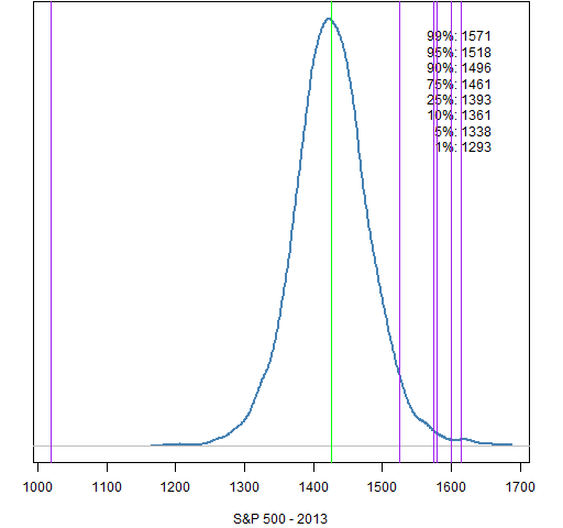
There are significant predictions for the S&P 500. Most of the predictions are assuming a truly higher market (and see also), while PaxForex is predicting a serious fall. Two of the predictions are via James Mackintosh who points out that forecasting depends a whole lot on luck.
Figure 2: Nasdaq Composite (USA) 2013 prediction distribution. 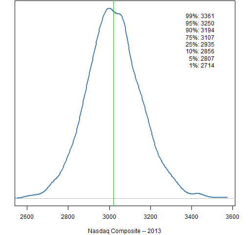
Figure 3: S&P/TSX Composite (Canada) 2013 prediction distribution. 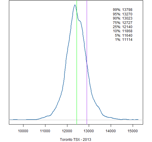
Bloomberg reports an average of 12,886 from 7 predictions, but doesn’t list the individual predictions. The prediction displayed is from BMO Capital Markets.
Figure 4: IPC (Mexico) 2013 prediction distribution. 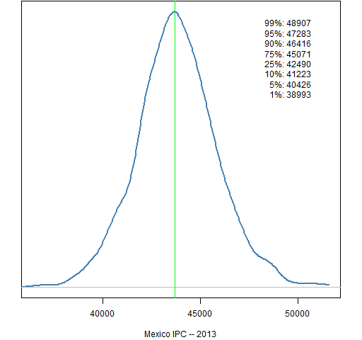
South America
Figure 5: Bovespa (Brazil) 2013 prediction distribution. 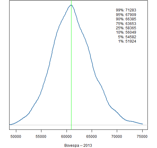
Figure 6: MERVAL (Argentina) 2013 prediction distribution. 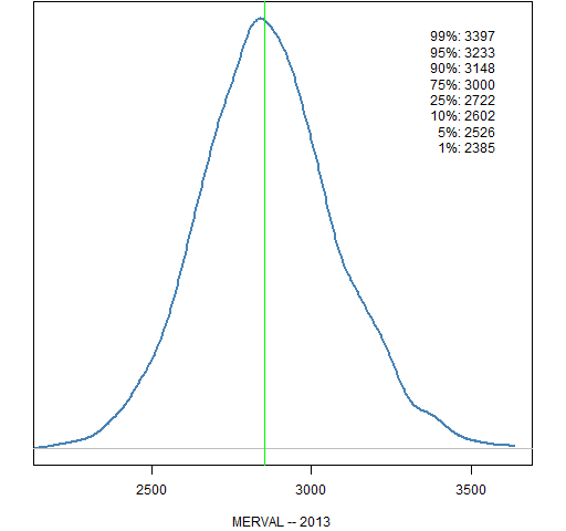
Europe
Figure 7: FTSE 100 (UK) 2013 prediction distribution. 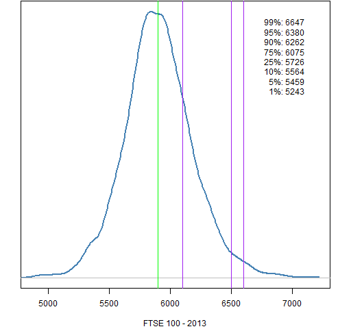 This is 4 predictions (6500 occurs twice) out of 7 that averaged to 6428 reported by the Financial Times.
Figure 8: CAC 40 (France) 2013 prediction distribution. 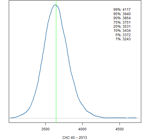
Figure 9: DAX (Germany) 2013 prediction distribution. 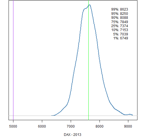 The prediction is Saxo Bank’s “outrageous” prediction. Is it really so outrageous?
Figure 10: AEX (Netherlands) 2013 prediction distribution. 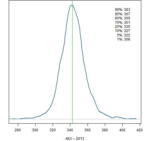
Figure 11: IBEX 35 (Spain) 2013 prediction distribution. 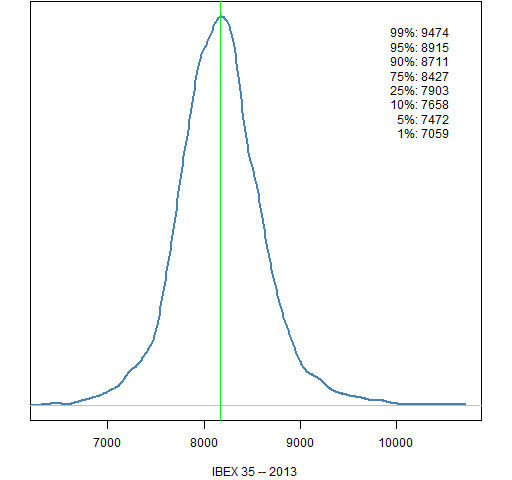
Figure 12: Euro Stoxx 50 (Europe) 2013 prediction distribution. 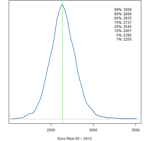
The East
Figure 13: Nikkei 225 (Japan) 2013 prediction distribution. 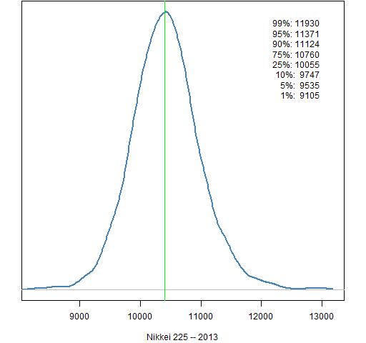
Figure 14: Hang Seng (Hong Kong) 2013 prediction distribution. 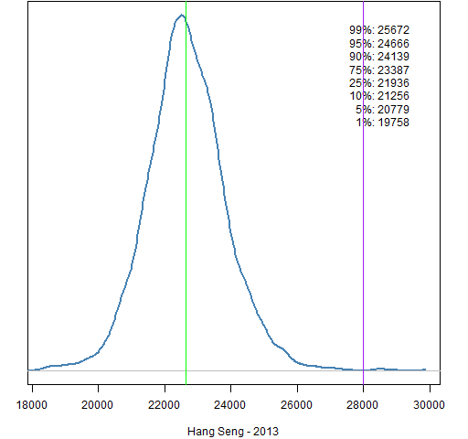 The wording of the 28,000 forecast is “hit” rather than “end the year at”.
Figure 15: Shanghai Composite (China) 2013 prediction distribution. 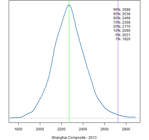
Byron Wien of Blackstone predicts “at least 20% up” — the line is at the 20% mark.
Figure 16: Straits Times (Singapore) 2013 prediction distribution. 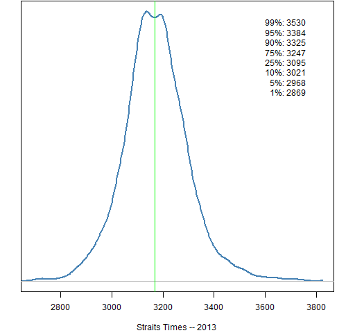
Figure 17: All Ordinaries (Australia) 2013 prediction distribution. 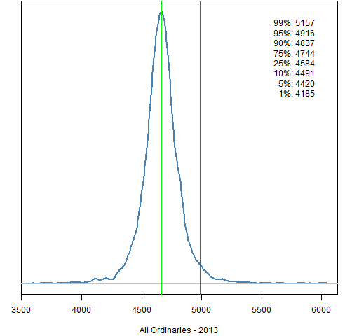
Shane Oliver of AMP Capital predicts “just shy of 5000 by the end of 2013”. I took that to be 4990.
Figure 18: Sensex (India) 2013 prediction distribution. 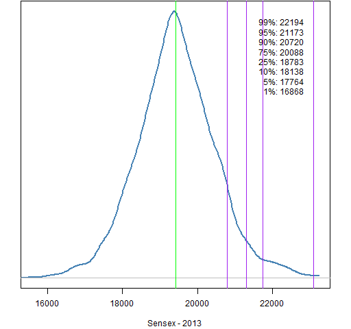
The predictions of four large banks are all on the positive side.
Previously
The post “Revised market prediction distributions” provides the methodology (which is summarized below).
Last year’s prediction distributions are in Market predictions for years 2011 and 2012.
Methodology
- start with about 10 years of returns
- take out an (excessively volatile) expected return at each point in time
- fit a GARCH(1,1) model
- simulate the garch model 250 trading days ahead starting with the current state (done 5000 times)
The simulation uses 50-day blocks. That is, for each simulated year 5 continuous blocks of length 50 are randomly selected from the standardized residuals from the garch model. With probability one-half the signs of all of the values in a block are switched — either all or none of the signs in the block are switched. This is meant to work around the autocorrelation in the residuals that is induced by fitting the overly rough expected returns.
Data sources
The stock data comes from Yahoo.
Appendix R
Some R functions that were used in the production of the plots are defined in prediction_dist_funs2.R.
The source function can be used in R to put the functions into your session, for instance:
source('https://www.portfolioprobe.com/R/blog/prediction_dist_funs2.R')
We’ve study a number of exceptional information right here. Surely worth book-marking with regard to returning to. I ponder just how much try out you set to build this kind of superb educational internet site.