A look at a simplistic measure of stock-picking opportunity.
Motivation
The interquartile range (the spread of the middle half of the data) has recently been added to the market portrait plots. Putting those numbers into historical context was the original impulse.
However, this led to thinking about change in stock-picking opportunity over time.
Data
Daily returns for almost all of the constituents of the S&P 500 from 2006 to early 2012.
Interquartile range
Figure 1 shows the daily interquartile range over the universe of stock returns through time.
Figure 1: Interquartile range of daily returns in percent of S&P 500 constituents. 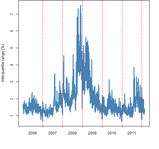 Figure 2: Interquartile range of daily returns versus the median return.
 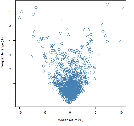 It could be that the spread of stocks would be different on up days as opposed to down days. As Figure 2 shows, that seems not to be the case.
Volatility adjustment
The pattern in Figure 1 is similar to the pattern of volatility over that time period as shown in Figure 3. The data in Figure 3 is the mean over the stocks of the garch(1,1) estimate of volatility on each day. The first few datapoints are unreliable — and visibly so.
Figure 3: Mean volatility as estimated by garch. 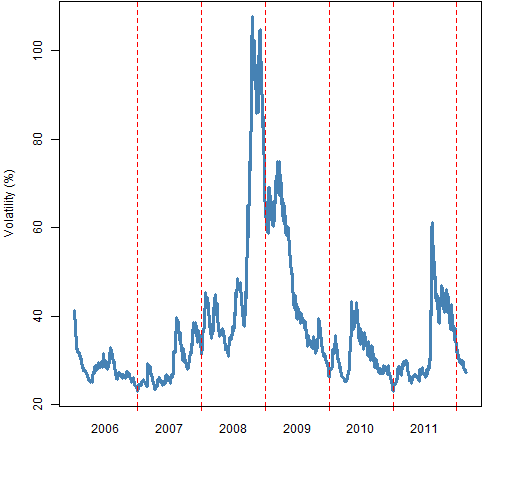 Figure 4 shows the time series of interquartile ranges divided by volatility. Large values of this ratio are good for stock-picking — stocks act differently from each other.
Figure 4: Interquartile range across stocks divided by mean volatility, with loess smooth (gold). 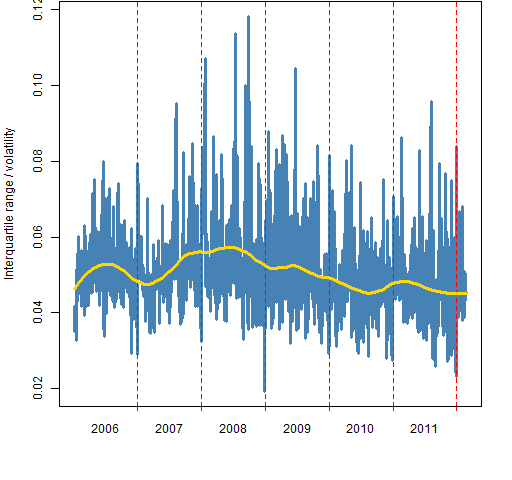
The gold line in Figure 4 is a loess fit with span equal to 0.25. It seems to be saying that opportunity increased in the early stages of the crisis, but has been declining since. I wouldn’t want to put too much faith in that without further investigation.
The equivalent of Figure 2 when both variables are adjusted for volatility looks remarkably similar. There is no indication of asymmetry.
Summary
The interquartile range is quite variable day to day, but definitely related to volatility.
Epilogue
when the world is mud-
luscious
from “In Just-“ by e. e. cummings
Appendix R
The basic data is the matrix of returns (days by stocks) called sp5.ret.
interquartile ranges
The vector of interquartile ranges was computed as:
sp5.riqr <- apply(sp5.ret, 1, function(x)
    diff(quantile(x, c(.25, .75))))
garch estimates
The code that did the garch estimations was:
require(rugarch)
sp5.garsigma <- sp5.ret
sp5.garsigma[] <- NA
for(i in 1:474) {
    JJ <- ugarchfit(ugarchspec(mean.model=list(
        armaOrder=c(0,0))), sp5.ret[,i])
    if(length(JJ@fit$sigma)) {
        sp5.garsigma[,i] <- JJ@fit$sigma
    } else cat('fail', i, '\n')
    cat('done with', i, '\n')
}
The test in the loop is for cases (one was observed) where the optimization of the garch model doesn’t converge and so it does not produce the usual output.
Then the mean volatility was computed:
sp5.garsigave <- apply(sp5.garsigma, 1, mean,
    na.rm=TRUE) * sqrt(252)
loess fit
Some preparation is needed in order to perform the loess fit.
iqr.df <- data.frame(standiqr = sp5.riqr / sp5.garsigave,
    time=1:1547)
Now we can do the plotting:
pp.timeplot(sp5.riqr / sp5.garsigave, div="year",
    ylab="Interquartile range / volatility",
    col="steelblue", lwd=3)
lines(fitted(loess(standiqr ~ time, data=iqr.df,
    span=.25)), col='gold', lwd=3)
The pp.timeplot function is available from https://www.portfolioprobe.com/R/blog/pp.timeplot.R
