How symmetric are the returns of the S&P 500? How does the skewness change over time?
Previously
We looked at the predictability of kurtosis and skewness in S&P constituents. We didn’t see any predictability of skewness among the constituents. Here we look at skewness from a different angle.
The data
Daily log returns of the S&P 500 from 1950 to 2011 October 17 were lying about. It is log returns (rather than simple returns) that we would expect to be symmetric.
Skewness through time
Figure 1 shows the rolling 250-day skewness throughout the time period. Figure 2 shows an informal method (explained in Appendix R) of assessing the variability of the skewness statistic.
Figure 1: Rolling 250-day skewness of the S&P 500. 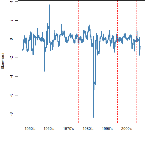 Figure 2: Rolling 250-day skewness of the S&P 500 (blue) with indication of its variability (gold).
 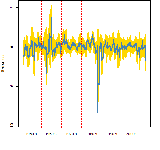 Note that zero is almost everywhere covered in gold. There doesn’t seem to be much reason to suppose that skewness varies from zero through time.
It is also interesting that the gold doesn’t extend much beyond the spikes in the realized series.
Skewness variability
Rather than looking at skewness over time, we can treat the data as a sample. We get a value of skewness for all the data. We can then bootstrap to see the variability of that statistic. Figure 3 shows the bootstrap distribution for skewness. It looks quite funny. What is going on? (Hint: the location of the actual statistic — the gold line — is a clue.)
Figure 3: Bootstrap distribution of skewness for the S&P 500 from 1950 to 2011. 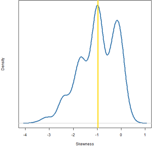 An explanation for the shape of the distribution in Figure 3 is that there is one datapoint that has significant influence on the statistic. The modes in the distribution correspond with how many times that datapoint is in the bootstrap sample. The right-most mode corresponds to zero occurrences, the second to right has one occurrence (including the actual data), and so on.
Figure 4: Bootstrap distribution of skewness for the S&P 500 from 1950 to 2011 except for 1987-10-19. 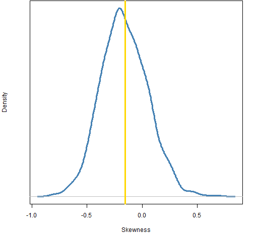 Figure 4 shows the bootstrap when we leave out that one influential point: 1987 October 19. This plot suggests that there is probably some negative skewness, but not enough that we can say for sure. Plus we have left out one slightly important datapoint. It is important in terms of skewness because obviously the market can “accidentally” go down 20% in a day, but it seems highly unlikely that it would “accidentally” go up 20%.
Questions
It is parsimonious to hypothesize that skewness is always zero. That doesn’t mean it is right. Are there good ways to test that hypothesis?
Epilogue
What immortal hand or eye
Could frame thy fearful symmetry?
from “The Tyger” by William Blake
Appendix R
Here is an outline of how the computations were done.
skewness function
The skewness function can be found in kurtskew.R except that by now a bit of a change is in order. Using sd on a matrix has been deprecated in R version 2.14.x. So a substitution for sd(x) when x is a matrix is:
apply(x, 2, sd)
Update: the original version of this file had a bug in the functions (the data were not properly centered). It was updated 2012-04-29. The numerical values in this post are off, but the patterns should be the same.
rollapply
The rollapply function from the zoo package was used to get the data for Figure 1:
spx.skew250 <- rollapply(spxret, 250, pp.skew, align='right')
A hiccup: The result of this command for some reason didn’t have names on it and pp.timeplot needs names that are dates in order to draw the time axis. spxret is just a named vector so the default method of rollapply will be the one that was used. But it was easy enough to add the names afterwards:
names(spx.skew250) <- tail(names(spxret), length(spx.skew250))
variability through time
Here’s how the variability in Figure 2 was computed. At each time point in the rollapply give a bootstrap sample rather than the actual data, and do that 20 times:
boot.skew250 <- vector('list', 20)
for(i in 1:20) boot.skew250[[i]] <- rollapply(spxret, 250, function(x){y <- sample(x, length(x), replace=TRUE);pp.skew(y)}, align='right')
boot.skew250mat <- do.call('cbind', boot.skew250)
rownames(boot.skew250mat) <- names(spx.skew250)
pp.timeplot(boot.skew250mat, div="decade", lty=1, col="gold")
bootstrap
The sample bootstrapping was just:
bootskew1 <- rep(NA, 1000)
for(i in 1:1000) bootskew1[i] <- pp.skew(sample(spxret, 15548, replace=TRUE))
Pingback: Monday links: Blue Monday | Abnormal Returns
I can see using daily data for the first part of your analysis, but why not use full year data for the whole sample?
I don’t have an objection to using annual returns, but what is your thinking in suggesting it?
Pingback: Popular posts 2012 February | Portfolio Probe | Generate random portfolios. Fund management software by Burns Statistics
Pingback: A slice of S&P 500 kurtosis history | Portfolio Probe | Generate random portfolios. Fund management software by Burns Statistics
Pingback: Popular posts 2012 May | Portfolio Probe | Generate random portfolios. Fund management software by Burns Statistics
Pingback: Popular posts 2012 August | Portfolio Probe | Generate random portfolios. Fund management software by Burns Statistics